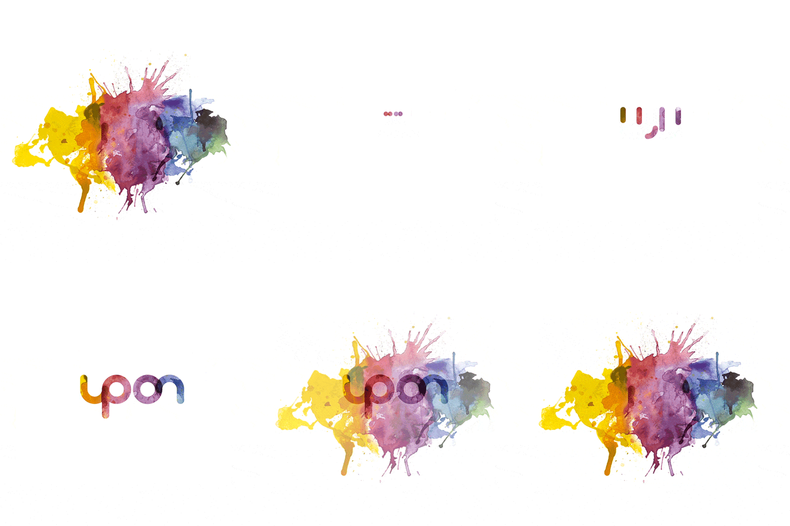
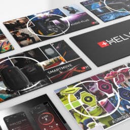
UPON visual identity is designed to meet the challenges of a competitive business and to connect naturally with customers. Every detail of the brand identity has been created to ensure that it is expressive of the brand and its values.
Simple, distinct, seamless. Warm, lively, engaging. Confident.
The fresh and contemporary visual identity is capable of enhancing the perception of dynamism and innovativeness of the brand and the conceived identity provides a flexible graphic platform with a credible, effective and consistent look and feel. The result is a powerful branding system that is connected and loyal to the core equity while expressing itself in contemporary design language and friendly visual imagery.

COLOURS and TYPEFACES, a consistent visual identity
The colour palette was chosen to reflect UPON values, the diverse range of services in a dynamic and forward thinking organisation. The colours are transparent and alive. Watercolour full spectrum conveys energy, creativity and excitement.
Typography is a strong extension of the brand’s personality and plays a major role in creating a consistent look across all communications and promotional materials. Round and simple font of Brandon Grotesque embodies precision, reliability and openness to the world.

LOGO and SYMBOL
Simplicity, overlays and geometry are the pillars to UPON logo and symbol design. Discover the ONdesign project in detail.


Follow up on LinkedIn ONdesign Italy
Do you like to be #ONdesignONair ?
ONdesign is always available to be contacted at:
Email: info@ondesignitaly.com
Phone: +39 06.64520314
Address: via della Piramide Cestia 1
00153 Rome, Italy


