AUGEN TELEMATICA: Graphical user interface Fiumicino airport kiosk
AUGEN TELEMATICA

graphical user interface for community
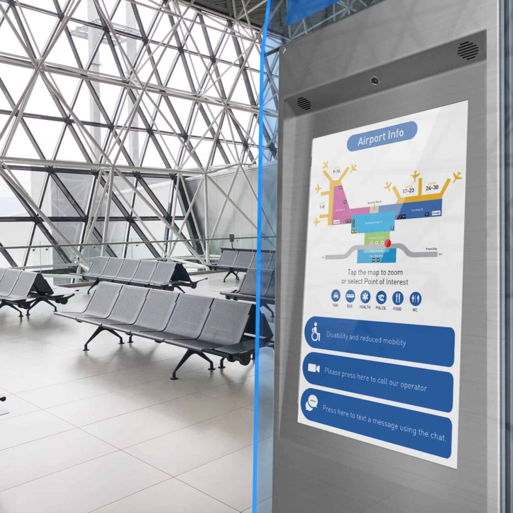
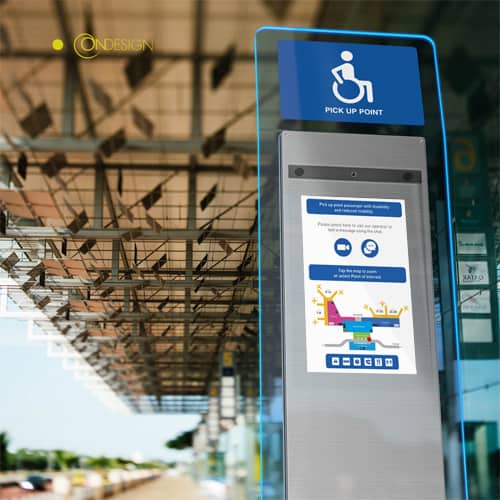
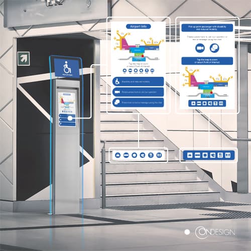
The GUI project at Fiumicino Airport focuses on improving accessibility through its Graphical User Interface (GUI) in interactive systems. This is crucial in ensuring that people with varying abilities can easily navigate big and crowded places like airports, train stations, or shopping malls. The goal is to create an interface that is intuitive and user-friendly, helping to minimize confusion and frustration for all users.
To achieve this, the design team carefully considers every aspect of the GUI, from the color scheme to the graphic elements and font size. Reassuring colors such as a combination of teal green, white, and light gray are used to create a calming atmosphere and ease the stress often associated with busy public places. Additionally, the right balance of graphic elements and font size ensures excellent legibility, making it easier for all users to read and understand the information displayed.
The result is a user-friendly GUI that allows users to access information and navigate the interactive systems quickly and efficiently. This helps to reduce wait times and improve the overall experience for all travelers at Fiumicino Airport.
In conclusion, the GUI project designed for Augen Telematica aims to make traveling easier and more accessible for everyone by creating an intuitive and user-friendly interface. With a focus on clear communication and ease of use, this project strives to make the airport experience as smooth and stress-free as possible.


