Nido app for Android and iOS ux ui design
NIDO
USER FRIENDLY APP for PARENTS
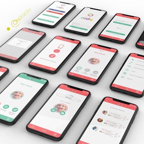
The design of the Nido App User Experience and User Interface is crucial in ensuring the app’s effectiveness in avoiding leaving a child alone in a car.
The iOS and Android application provide parents with the ability to control a device that alerts them if they forget their child in the car.
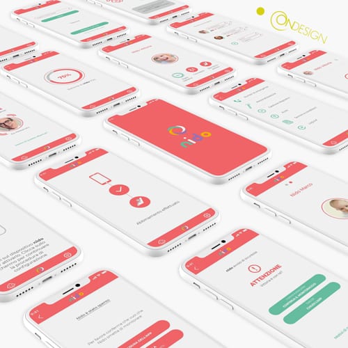
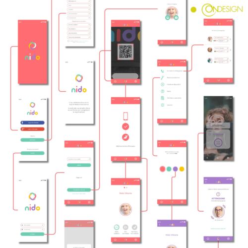
In term of User Experience (UX), it is intuitive and user-friendly. Most importantly it makes easy for parents to navigate and use the app. The UX minimizes the risk of user error ensuring the app functions effectively in avoiding the dangerous situation of a child being left alone in a car.
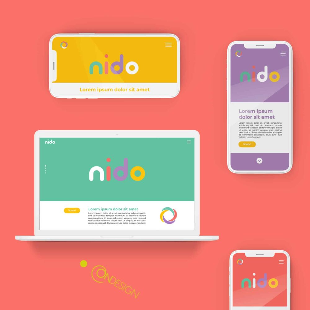
When it comes to the User Interface (UI), it is visually appealing and consistent with the company brand’s image. Furthermore it clearly communicates the app’s features and functionality. Users can easily understand how to use the app and control the device. The UI is user-friendly, ensuring that even those who are not technically savvy can effectively use the app.
In conclusion, the design of the Nido App User Experience and User Interface is essential to its effectiveness in preventing children from being left alone in a car. The app is easy to use, visually pleasing, and minimizes user error, providing peace of mind for parents.


